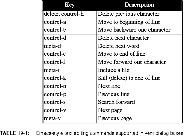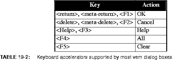


Vem uses dialog boxes based on the MIT Athena widgets to handle these situations. Dialog boxes are windows that resemble business forms. These windows contain labeled fields for entering text, changing numerical values, and selecting options. This section describes how to use dialog boxes.
All dialog boxes in vem have the same form. An example is shown on
page 2-14, and also in figures
19-1 on page 12 and
19-2 on page 14. At the top of all dialogs is a one line title indicating the purpose for the dialog. The middle of the dialog (known as the body) contains fields for displaying and editing information of various kinds. At the bottom of the dialog are a number of control buttons. Each control button represents a command. The arguments to the command are the values of the fields displayed in the body. Thus, operating a dialog consists of editing or changing fields in the body and then selecting a command by activating a control button. Six kinds of fields may appear in the body of a vem dialog: editable text, non-editable text, enumerated value, numerical value, exclusive lists, and non-exclusive lists. A description of each field type is given in the paragraphs that follow.

Non-editable text fields are used to display text messages. They consist of a box containing text and an optional scrollbar. The scrollbar operates just like those used in editable text fields.
Enumerated value fields are used to specify one value out of a small list of values. They consist of a value displayed inside a box and a descriptive label to the left of the value. The border of the value highlights as the mouse cursor moves over it. Depressing and holding the left mouse button inside the value box causes a menu to appear that displays all possible values. The choices will highlight as the mouse cursor moves over them. To select a new value, release the mouse button when the desired choice is highlighted. The new value will appear in the value box. One can leave the value unchanged by releasing the mouse button outside the menu boundary.
A numerical value field is used to specify a magnitude between a predetermined minimum and maximum. Visually, it consists of a box containing a numerical value, a horizontal scrollbar to the right of the box for changing the value, and a label to the left describing the value. The magnitude of the value is changed by operating the scrollbar. Pressing the left and right buttons in the scrollbar decrement and increment the value by one unit. Pressing the middle button changes the value based on the distance between the mouse cursor and the left edge of the scroll bar. The middle button may be pressed and held to interactively modify the value. Most people use the middle button to set the value roughly then use the left and right buttons to make the value precise.
Exclusive lists are used to choose one possible value out of a (possibly quite large) list of values. These values are displayed in a box with a scrollbar on the left edge of the box. Each value consists of a button box on the left and a descriptive label to the right. As the mouse moves over a button box, it will highlight to indicate it can be activated. The button box of the selected item will appear dark while all others will remain light. If there are too many values to display in the box at one time, the scrollbar can be used to scroll through the possible values. The scrollbar operates in the same way as described for editable text fields.
Non-exclusive lists are used to choose zero or more possible values from a (possibly quite large) list of values (see figure 19-2 on page 14). A non-exclusive list resembles an exclusive list both in appearance and operation. However, unlike an exclusive list, one can choose any number of items in a non-exclusive list. Visually, the two lists are distinguished by the appearance of the button boxes. Exclusive button boxes resemble radio buttons. Non-exclusive button boxes resemble check marks. Pressing the left button in a non-exclusive button box causes the value to toggle (i.e., if it was selected it becomes unselected, if it was unselected it becomes selected).


